ODEMIN GAMES
Brand Identity Design Document
DATE: December 4, 2025
VERSION: 1.0
REF:
Executive Summary
Odemin Games is a new PC game development studio focused on the simulation and base-building genre. We create deep, complex systems wrapped in accessible, clean presentations, catering to the "hardcore casual" market—players who enjoy the depth of games like RimWorld or Oxygen Not Included but value intuitive design.
The brand identity is built on the concept of Agency and Destiny. The name, inspired by the Chinese phrase "Wo de ming" (My Fate), reflects our core philosophy: we provide the parameters and the code; the player determines the outcome.
This document outlines the visual and verbal elements that communicate Odemin Games’ unique position at the intersection of ancient concepts of fate and modern digital engineering.
Brand Strategy
2.1. Target Audience
The "Hardcore Casual" PC gamer.
- They appreciate deep mechanics, systems optimization, and emergent storytelling.
- They value respect for their time; they want depth without needless obfuscation or clunky UI.
- They are turned off by "mobile-game" aesthetics (excessive brightness, rounded simplicity) but also find hyper-gritty military sims unappealing.
2.2. Brand Archetype: The Architect (Creator)
Odemin Games is a builder of worlds and systems. We are structured, intelligent, and precise. We don't just make games; we engineer simulation engines that allow players to exercise creativity and control.
2.3. Core Value Proposition
Deep Simulation, Clean Presentation.
Complex under the hood; intuitive on the surface.
Verbal Identity
3.1. The Name: Odemin
While inspired by the Pinyin for "My Fate," this origin is an internal guiding pillar, not public-facing marketing.
Epic narratives born from minimalist beginnings.
Control, systems, and technical authority.
3.2. Tagline Exploration
Taglines should bridge the gap between the ancient concept of "Fate" (our logo) and the digital nature of our products.
Code is Fate.
Build Your Destiny.
Engineered Emergence.
Visual Identity
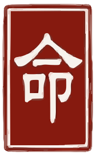
4.1. The Primary Logo: The "Seal of Fate"
The core of the visual identity is a traditional Chinese seal (chop), representing authority, ownership, and a timeless imprint on reality.
The concept is a "Yin" (Negative Space) seal containing a single character.
- Character: 命 (Mìng), meaning "Life" or "Fate."
- Composition: The single character is vertically elongated to fill the entire height of the square enclosure, giving it a monolithic, imposing presence.
- Style & Texture: The seal must not look digitally perfect. It must appear artisan-handcrafted. The edges should be slightly irregular, showing the texture of carved stone and the imperfect bleed of ink on paper.
4.2. Logo Typography (Supporting)
The supporting text "ODEMIN GAMES" must contrast with the ancient, organic feel of the seal. It should be clean, modern, and technological.
Geometric, squared-off Sans-Serif.
Clean Monospaced font.
4.3. Color Palette
Cinnabar Red
Deep Slate
#2B2D42
System White
#EDF2F4
Drafting Blue
#8D99AE
4.4. Imagery and Aesthetic Guidelines
⚠️ The "Anti-Strawberry" Rule: CRITICAL
Due to a linguistic conflict in Ojibwe, the brand must strictly avoid any organic imagery that resembles berries, leaves, or soft, rounded fruit shapes.
- Isometric perspectives.
- Visible grids, blueprints, and wireframes.
- Structures being assembled from blocks or voxels.
Application Examples
5.1. Game Splash Screen
5.2. Steam Store Capsule (Small)